
micro:bit ML & CreateAI
Data Analysis Tool

- Click Choose File and select the file you would like to upload.
- This file must be downloaded from either the micro:bit Machine Learning Tool or micro:bit CreateAI site and be a JSON file!
- You can download this on these sites by clicking the menu button (three dots) and clicking Download all data samples.
- When you open a file, the actions you recorded appear as buttons.
-
When you click on any action, 4 graphs will appear:
- The first 3 graphs show the x, y and z coordinates of all the Recordings. You can use these to decide how similar your Recordings are!
- The final graph show the x, y and z coordinates from one Recording at a time. A drop down list lets you select which Recording to investigate.
Each of your graphs below has these tools:
- Clicking on the Recordings at the top of each graph will make them appear and disappear. You can uses this to help find which Recordings are similar.
- The first three graphs (x, y and z) display the correlation of the Recordings - this just means how similar they are. As you make your Recordings appear/disappear these numbers will change to show the correlation for the Recordings you can see! This is helpful for finding which Recordings are similar.
- Clicking Toggle Table will make the table under the graph appear and disappear.
- Hovering over any point will tell you it's value.
- Your Machine Learning model works by finding patterns in your Recordings - but this is tricky!
- To find patterns your Recordings need to be similar. If all your Recordings look very different then it will be very hard for your model to find patterns (it will still try and just be bad at guessing!).
- But, if all your Recordings are the same then there are no patterns!
- This makes things tricky! This tool can help you analyse and may help you improve your Machine Learning model.
- The graphs are a good way of checking if your Recordings are similar with your eyes. If they do look similar then your data is good. If they look very different then your data might be bad.
-
The correlations are a good way of checking if your Recordings are similar with maths! Correlation just means how similar things are - your graphs have two correlations:
- The Shape Correlation tells you how similar the shape of your Recordings is - in other words how well do the lines match up. If your lines are the same they will have 100% correlation, if your lines are opposites they will have -100% correlation.
- The Shift Correlation tells you how similar your Recordings would be if they were moved left or right - in other words if you lined them up as best as you could. Be careful as this correlation does not care about shape, so the number can be very high even if the Recordings don't look very similar!
- Click Choose File and select the file you would like to upload.
- This file must be downloaded from either the micro:bit Machine Learning Tool or micro:bit CreateAI site and be in JSON format!
- You can do this on these sites by clicking the menu button (three dots) and choosing Download all data samples.
- When a JSON is opened, each of the actions recorded using the Machine Learning or CreateAI tools will appear as buttons. Each action is displayed as a separate tab - i.e the actions cannot be compared with one and other.
-
For each action, 4 graphs appear:
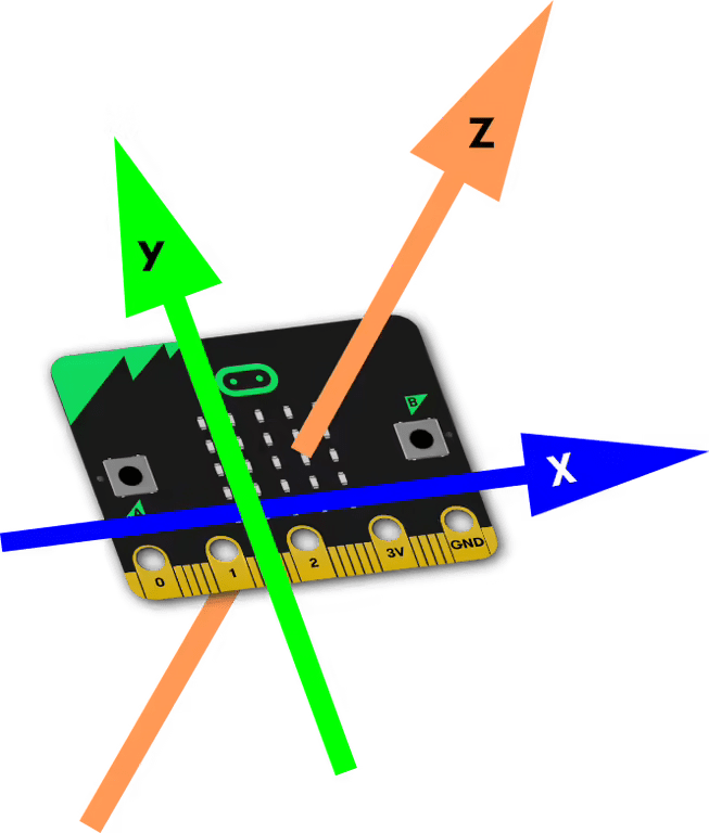
- The first 3 graphs display the x, y and z coordinates of all the Recordings - these can be used to determine the consistency in each Recording, and whether any are drastically different. The coordinate system of the micro:bit is shown on the left.
- The final graph displays the x, y and z coordinates from a single Recording at a time. A drop down list allows you to select which Recording to investigate.
Each graph below can be investigated using the following:
- Clicking on each Recording/Axis in the legend of each graph will toggle the visibility of that Recording/Axis. This can be used to help find which Recordings are consistent and which are outliers.
- The first three graphs display the correlation of the data. This is essentially how well each of the Recordings (for the particular coordinate) match. This is provided as a percentage for understandability. Toggling the visibility of Recordings will alter the correlation to reflect the selected data. This can also help find outliers.
- Clicking on Toggle Table will toggle the table containing the values of each datapoint of each visible Recording/Axis.
- Hovering over any datapoint will tell you it's value.
- For Machine Learning to work, patterns must be present in the data, but this is not an exact science!
- The data recorded for each action must be relatively similar for patterns to be found - if the Recordings for an action are wildly different then it will be very hard for the model to find any realistic patterns (though it will still try and return unexpected results!).
- However, if all the Recordings for an action were identical then there would be no patterns to observe (as only that exact pattern would be registered as that action).
- This is a fragile balance, and the tools on this page can help analyse your Recordings and may help improve the effectiveness of your Machine Learning models.
- The graphs provide a good visual indication of whether data is similar. If the curves look similar then the data is good. If there are wildly different patterns then the data is likely bad.
-
The correlations can also provide a good mathematical indication of whether data is similar. Two measures of correlation are given:
- The Shape Correlation defines how well each of the Recordings match based on their shape (i.e. how well do the lines match up). Lines that match perfectly will have 100% correlation, lines that are perfect opposites will have -100% correlation. Note that this does not take any offset (along the x-axis) into account, and therefore will give Recordings that are offset from each-other, but have an identical shape, low correlation values. This uses the Pearson Correlation.
- The Shift Correlation defines how well each of the Recordings would match if they were shifted (offset) to their best possible alignment. This massively downplays the importance of shape (by correlating by frequency) and should be taken with a grain of salt (as values may be misleadingly high). This uses the Modified Pearson Correlation (Phase Invariant).
X Values
Shape Correlation: 0.00%
Shift Correlation: 0.00%
Y Values
Shape Correlation: 0.00%
Shift Correlation: 0.00%
Z Values
Shape Correlation: 0.00%
Shift Correlation: 0.00%